

Using the Data Table Analytics module
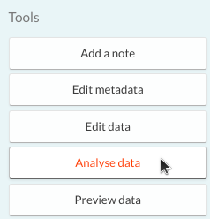
If you select a database table or a CSV file, in the right-hand sidebar you should see the 'Analyse data' option.
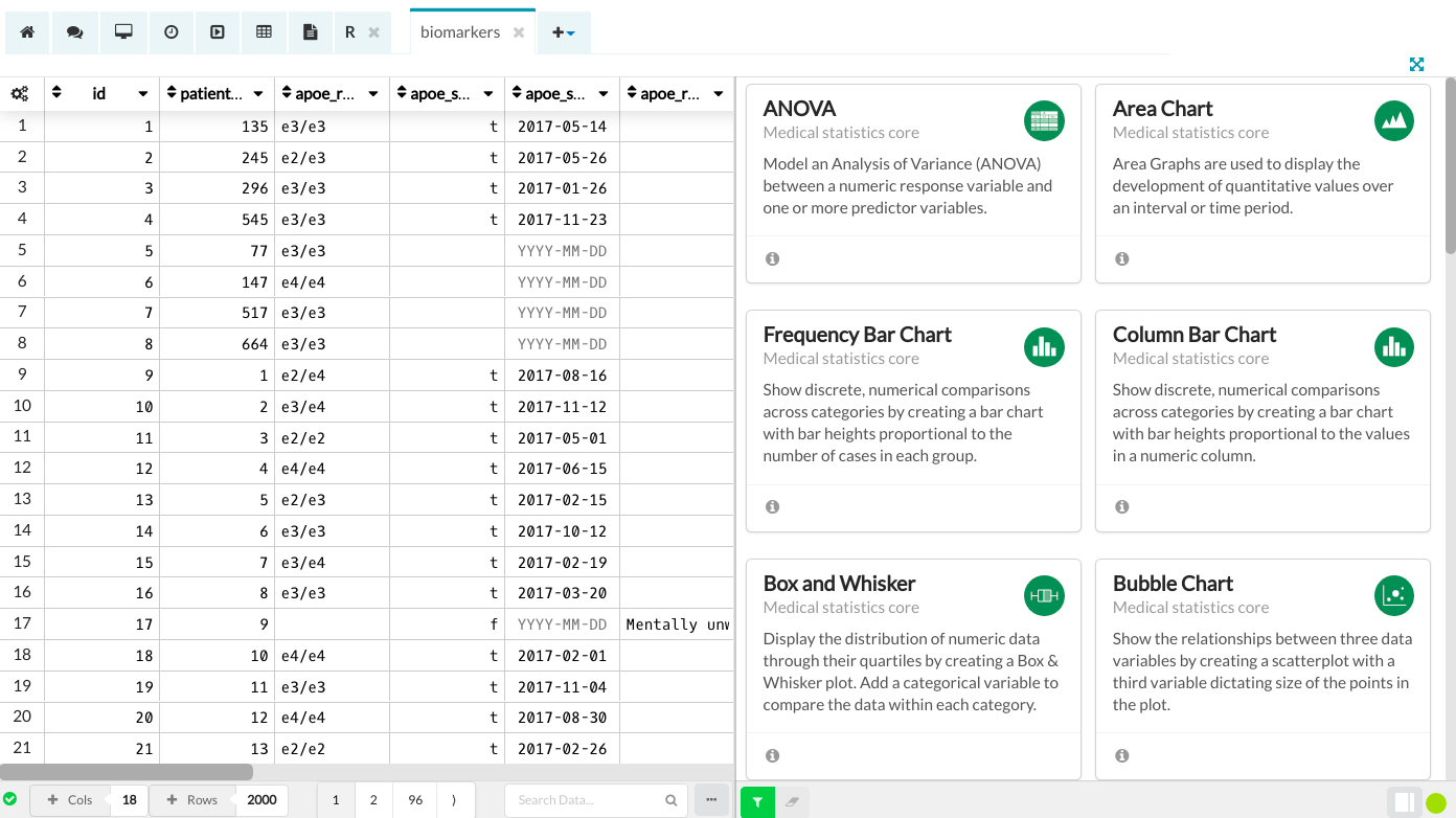
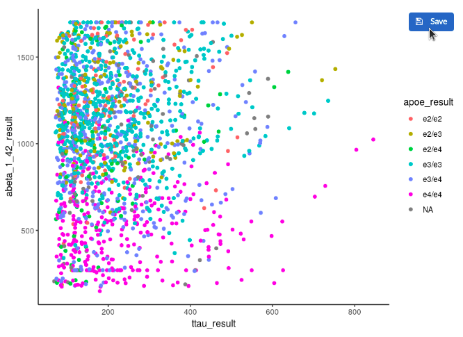
Clicking on it will open the Data Table Analytics, which is very similar to the Data Table Editor but it also includes an analytics sidebar with over 20 modules that cover the core of medical statistics: from scatter plots to logistic regression. These modules enable quick visualisation and analysis of data.
Once the table opens, you can run a module in one of the two ways: either by first selecting the module or by first selecting the data. For more details, see the sections below.
Selecting the module
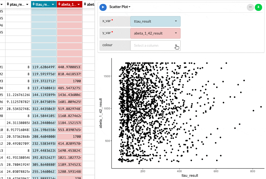
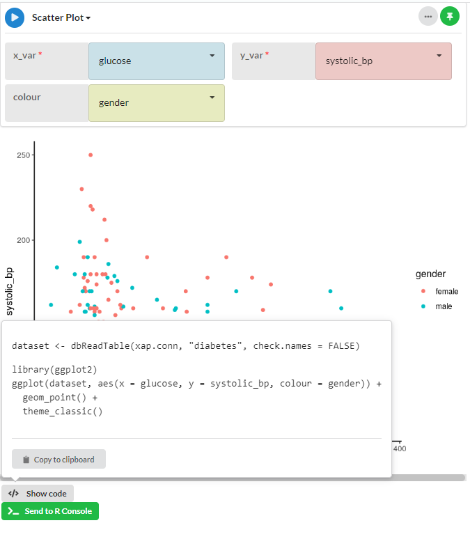
From the list on the right-hand side, select the module you are interested in and the module will open on the right half of the screen. Use the dropdown boxes to select the table columns you would like to analyse. When the mandatory boxes are filled, your chart will be generated and displayed.
You can change the data by selecting different columns in the dropdown boxes and pressing the Run button beside the module name. From the same window, you can also select a different module by clicking on the name.
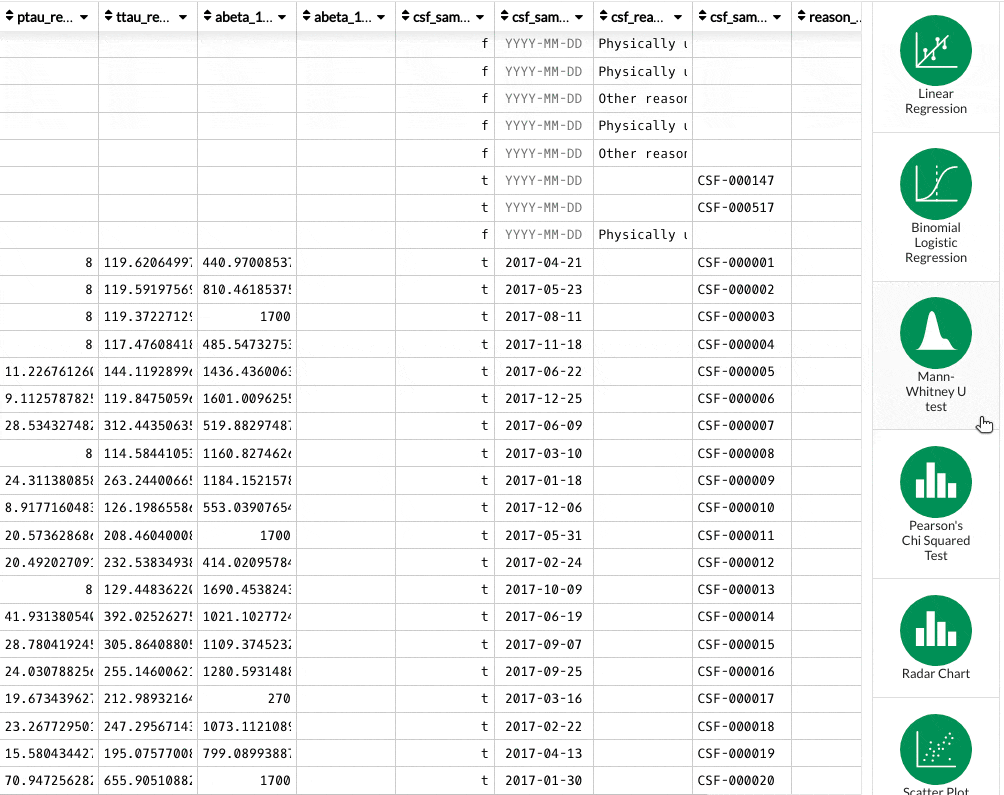
Selecting the data
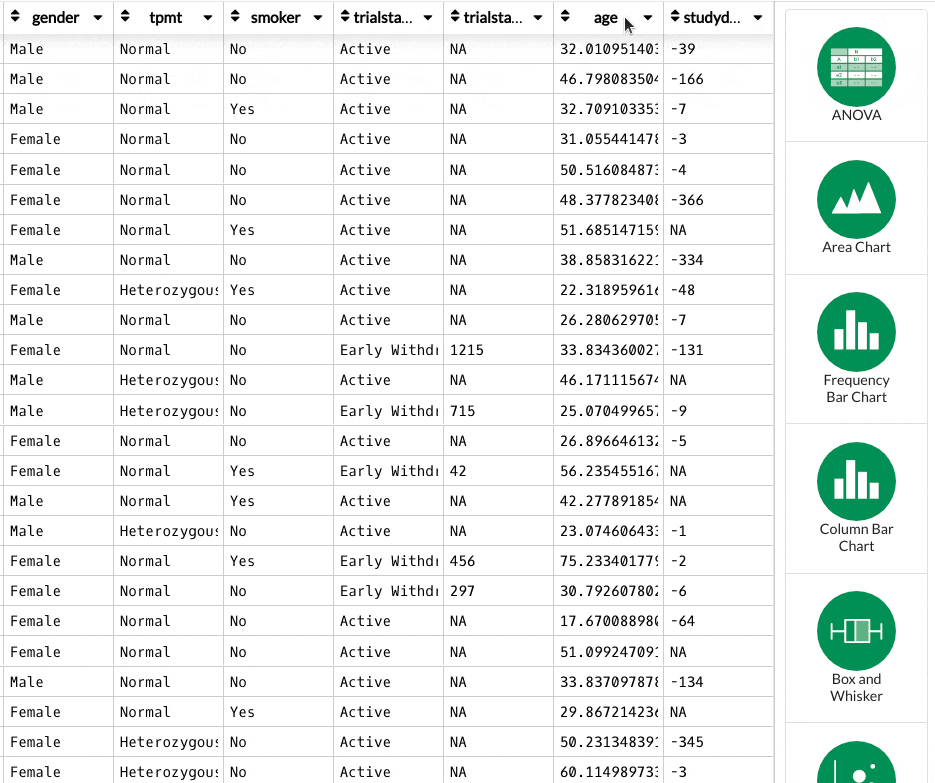
From the data table editor, you can select the columns of data you want to analyse by clicking on the column names. Your first selection will be taken as an X variable, the second as a Y, and so on. As you select more columns, the modules filter down to show only the ones that are compatible with the selected data types. Click on a module to run it, and the visualisation will be displayed.
Again, you can change the data by selecting different columns from the dropdown boxes and then clicking the Run button.
Saving the plot
Hover over the image and a button will be displayed giving the option to save the plot as a .png file. The plot will be saved in the workspace Blobs.
Showing the code
Below the generated plot there is a button called </> Show code. Hovering your mouse over this button shows you the R code that was used to generate the plot and gives you the option to 'Copy to clipboard'.
Clicking on Copy to clipboard will copy the R code used to generate your image to your clipboard so that you can use it elsewhere.
The other button, Send to R Console, will send the code to the workspace R console if you already have one running or it will open a new session and run the code there.
Getting help
If you need help with any of the modules, click on the Info icon. This will open a page in the knowledge base explaining the usage of that module and the required parameters.

Limitations
Please note that analytics modules will run in normal mode when the Dataset that is being analysed has less than 10,000 rows and 100 columns for a CSV file, and if it's less than 250,000 cells for a database table. If it is bigger than that, it will run in sample mode. You can read more about sample mode in this article.