

Heatmap
Graphically represent data where individual values contained in a matrix are presented as colours.
Details
Produce a heatmap using two column variables in a given data table. A heatmap is used to show the graphical correlation between the two categorical variables when mapped against a numeric fill variable.
Heatmaps are ideal when you are conducting an exploratory analysis in order to investigate the relationship between variables in your data table.
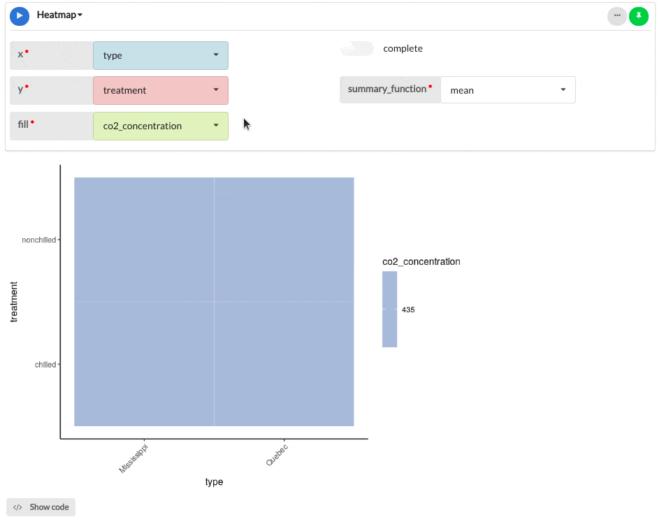
Output
The example heatmap below shows the CO2 uptake results from an experiment on the cold tolerance of the grass species.
Parameters
| Variable name | Required | Constraints | Description |
|---|---|---|---|
| x | Yes | Column Input. Text, Integer, Decimal Boolean, DateTime, Date max. 30 values. | The values of this column will be mapped onto the X-axis. |
| y | Yes | Column Input. Text, Integer, Decimal Boolean, DateTime, Date max. 30 values | The values of this column will be mapped onto the Y-axis. |
| fill | Yes | Decimal, Integer | The values of this column will determine the correlation between the x and y columns provided above. The fill variable determines the heatmaps colour scale and correlation intensity. |
| complete | Yes | Toggle between true and false | Toggle between whether you would like to complete the missing variables or not. This parameter will fill in any white space created in the heatmap. |
| summary_function | Yes | choose from none, min, max, mean, median and sum | Apply a range of R summary options to the fill variables, or none at all (default). |
See Also
Updated on October 16, 2023