

Density plot
Display the distribution of continuous numeric data by creating a density plot. This chart is a variation of a histogram that uses kernel smoothing to plot values.
Details
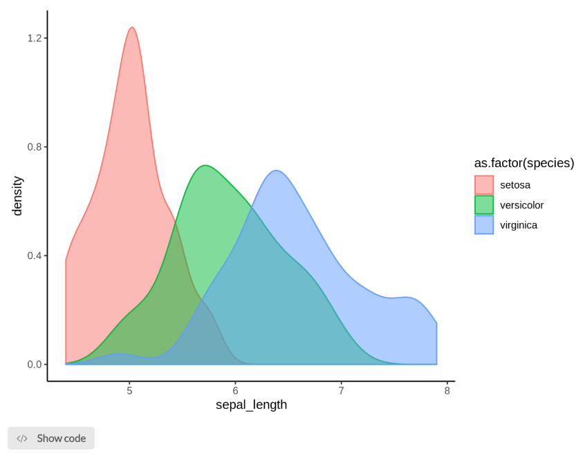
A density plot visualises the distribution of data over a continuous interval or a certain time period. The peaks of a density plot help display where values are concentrated over the interval. An advantage density plots have over histograms is that they're better at determining the distribution shape because they're not affected by the number of bins used (each bar used in a typical histogram).
Output
The example below shows a density plot of sepal length grouped by the flower species.
Parameters
| Variable name | Required | Constraints | Description |
|---|---|---|---|
| x | Yes | Column Input. Integer, Decimal | Numerical variable upon which the density will be plotted. |
| group | No | Column Input. Text, Integer, Boolean, Date, DateTime | Categorical variable upon which grouping will occur. |
| alpha | Yes | Decimal ranging from 0 to 1 | Edit the transparency of the output with 0 being completely transparent and 1 being completely opaque. |
See Also
Updated on November 2, 2022