

Creating a rapid visualisation
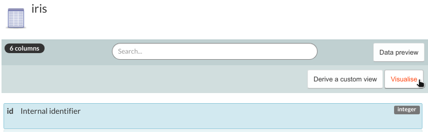
To create rapid visualisation of your data table, open the table in the Database tab, then click the 'Visualise' button in the central panel.
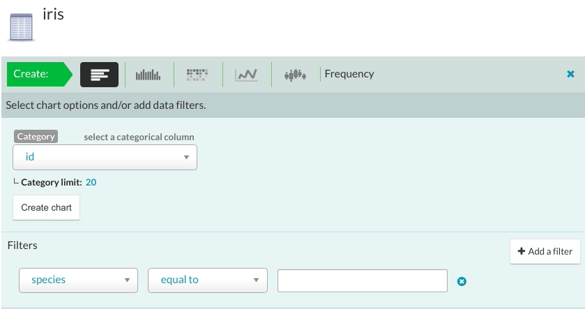
This opens a new panel with the following parameter selection for creating rapid visualisations:
- Chart type: the type of chart to create. You can choose from a frequency graph, histogram, heatmap, time series and boxplot graphs.
- Data: choose one or more data table columns to be used for creating the charts. Some graphs only allow one field.
- Filters (optional): filter the data before creating the visualisations. You can choose the column, operator, and value to filter by.
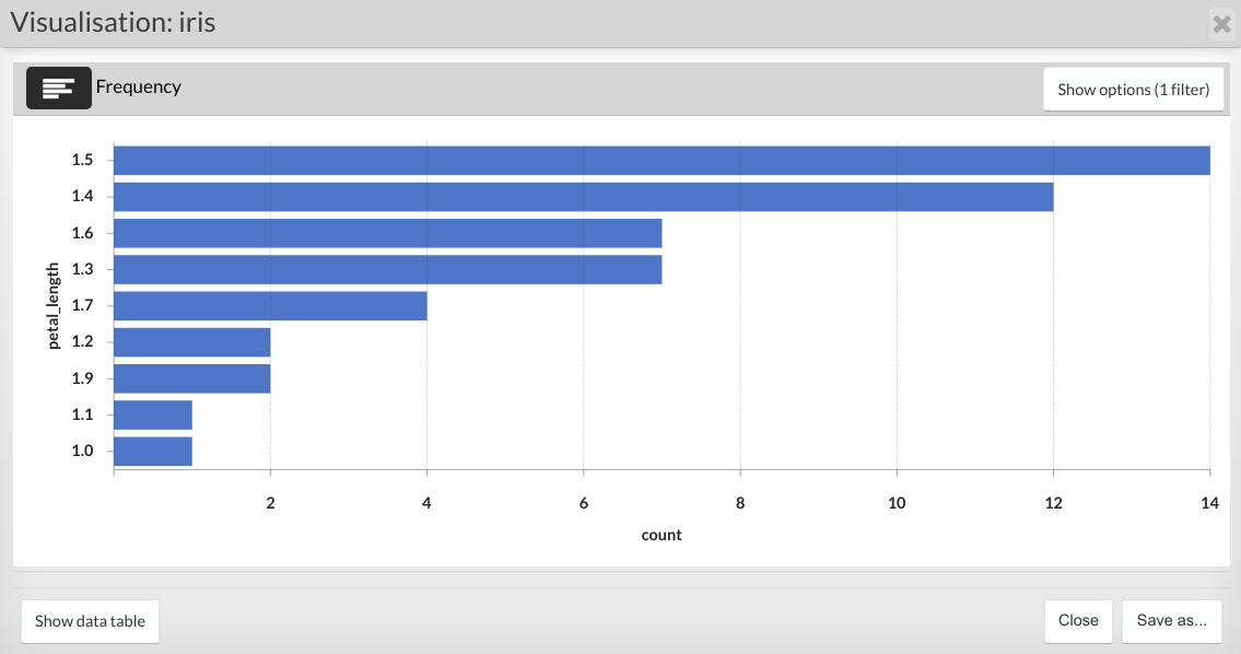
Click the ‘Create chart’ button. The resulting data visualisation will appear in a popup window.
You can edit the filters used to create the original visualisation by clicking the 'Show options' button. Once you are ready to apply your new filters, click the popup window to refresh the visualisation.
The visualisation can be saved either as an SVG file within the workspace file system or as a note attachment which can be shared with other members of your team.
Updated on October 16, 2023