

Bubble chart
Show the relationship between three data variables by creating a scatterplot with a third variable dictating the size of the points in the plot.
Details
Like a scatterplot, bubble charts use a Cartesian coordinate system to plot points along a grid where the X and Y axis are separate variables. However, unlike a scatterplot, points are also assigned a third numerical variable which is then represented by the area of the circle in the bubble chart.
Colours can also be used to distinguish between categories or used to represent an additional numerical variable. Time can be shown either by having it as a variable on one of the axis or by animating the data variables changing over time.
The potential for overplotting in a bubble chart is greater than for a scatterplot where points may be plotted on top of one another since some points can be larger in a bubble chart.
Output
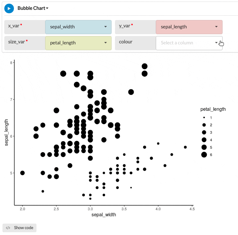
The example bubble chart below shows the sepal length plotted against the sepal width, the size of the points is proportional to the petal length variable, and the hue of the colour corresponds to the petal width.
Parameters
| Variable name | Required | Constraints | Description |
|---|---|---|---|
| x_var | Yes | Column Input. Decimal, Integer | The values of this column will mapped continuously to the x-axis of the plot. |
| y_var | Yes | Column Input. Decimal, Integer | The values of this column will mapped continuously to the y-axis of the plot. |
| size_var | Yes | Column Input. Decimal, Integer | The values of this column will be used to scale the size of the points. The values in this column will be proportional to the area of the circles in the plot |
| colour | No | Column Input. Decimal, Integer, Text, Boolean, DateTime, Date | The values of this column will mapped to a colour scale for the plot. The points of the plot will be coloured depending on the values in this column. For categorical data like Text or Boolean, different, contrasting colours will be used for each category. For numeric data, a continuous colour scale will be used. |